2012-06-05

#3


"Introverted moths don't envy the butterfly", 2012.
Ink and Gouache + digital

2012-05-29

#2!

Here it is! The second illustration of the series, ever since I decided to complete and upload a drawing/painting every 5 days!

This is on based off something that floated into my head a couple of days ago. I guess that theme of both my writing and illustration work lately is growing up and overcoming fears.

Enjoy!

"Childhood Screams and Dreams of Climbing Higher Beams", 2012.
Ink, gouache, pastel pencil, digital


2012-05-28

Renewed Marriage Vow to Illustration!

As of lately, I have decided to stretch my boundaries as an illustrator to begin and complete a drawing/painting every 3-5 days. Here is the first one that I did about four days ago. It only took me about three days to complete. This has been a huge step since during the school year, it takes me about a month to complete my work because of procrastination and social distractions.

Here's to a happy and newly committed relationship, Illustration!


"Don't Ride in a Boat with Doubt Rocking About", 2012.
Ink and Gouache.


I have really found that writing poetry and stringing little word puns together has given me a jumping off board to create interesting and conceptual solutions. 


I should have illustration number 2 up and posted by midnight tomorrow! 


2012-05-23

May Updates!


So, the whirlwind of University has ended for the next six months, and I finally have time to update! What will come next? Hong Kong? San Fransisco?  Toronto? I am planning to save and saving to plan (a trip).  For the past couple of months, I have done illustrations for Discorder Mag, and here they are. I also have a couple larger illustration projects on the go. One of them being book illustrations for Grimms Fairytales, and the other, a series of digital prints. On the side, I am also working on my grad project, which will be shown at the Emily Carr University of Art and Design Grad Show, May 2013. 

May 2012 

April 2012

March 2012

2012-03-30

BRAND NEW BOX was so much fun!


The opening for Brand New Box was so much fun! Lots of people came out to see the print show, and I was really excited to see the variety of styles and mediums. The Fall Gallery really cleans up nice! With DJ Guttermax providing the music, the bar behind the counter, and all the people who came out to see the work, the evening was a success! There were even people dancing, me included of course, and I'd say that dancing in an opening is pretty much the definition of success!

Here I am with my prints! They are still up for grabs, and will be on display until April 15! Come check them out!


For more event photos (without just me in them), click

A

2012-03-05

BRAND NEW BOX show @ The FALL Gallery

Come check out the print show, BRAND NEW BOX at The FALL Gallery March 15, 2012! The opening will be at 8pm, but the show which will include prints by twelve emerging artists, including yours truly will be up for sale!

click to go to the facebook event page


(poster by me as well :))

2012-02-12

Hand-lettering illustration for Discorder Magazine - Feb. 2012 issue!


This month, I did a hand-lettering illustration for Discorder magazine for their article and promotion for Sizzleteen Records, a new local record label and their launch party.  I hadn't done a lot of hand-lettering, but I have been dabbling in it for fun lately. After discovering Jessica Hische, an amazing illustrator, letterer, and designer, I was inspired to experiment with some hand-lettering of my own (Here's an attempt with a recent illustration I did and you can also see it throughout my website www.priscillayu.com).  I have never taken a typography course, and have an elementary understanding of type hierarchy and history, but to me, hand-lettering kind of breaks the rules in a beautiful way that may make traditional typographers cringe. I hand-lettering that is illustrative, figurative, embellished, and sometimes really ugly. 

So ugly, it's beautiful. 

Recently through learning about "Beauty is Embarrassing" -- a documentary on Wayne White, I  realized that I had seen Wayne White's his word paintings before on art blogs before. They are beautiful, and visually stimulating. You can  literally feel your eyes working when you're looking at them.  Their complexity in translation of three-dimensional form into two-dimensional paintings that create an optical illusion especially appeal to my tastes!

Anyway, below are two  iterations  that I also sent into the art director at Discorder Magazine, before he chose the final version that is published.  


2012-01-24

Fluevog Creative


 Click here to look at my submission and description on fluevog.com!

Last week, I was browsing the Fluevog website as I often do, and decided to try my hand at one of their contests to win $1000 VOG dollars, a personal bio on fluevog.com, and have the winning ad shown in a variety of magazines. I came up with the image above.

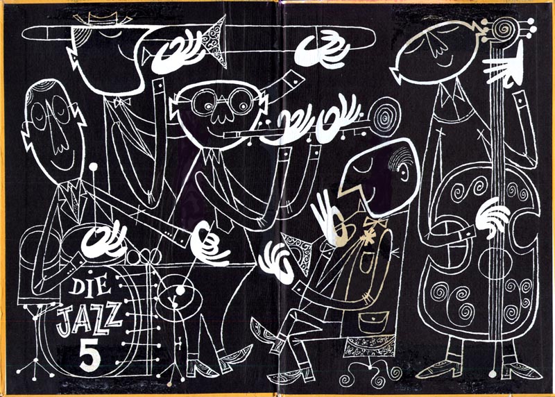
Using one of Fluevog's previous slogans, "Unique Soles for Unique Souls", the ad that I made was inspired by fifties illustration and advertisement, as well as jazz and soul music. I was also inspired by Cliff Roberts illustrations. I love his simple colour palettes and whimsical renderings of characters.

Cliff Roberts illustrations

2011-08-10

The Nomad Show!


Come check out art by local and international artists at the second Nomad Gallery Opening Night August 12th, 2011, at 7pm-10pm! I have two paintings in it, and the show will be up until September 10, 2011.

Cheers!
Priscilla

2011-07-03

Doodles

So, I've been thinking about pattern-making lately. Here's a doodle from a couple weeks ago, and two from last year that I haven't posted. It's always fascinating to see old work resurface for new purposes!


Discorder Magazine calendar illustration - June 2011 issue

This is an illustration that I did for last month's issue of Discorder Magazine. The first iteration was intended for a colour spread, and the second iteration was the final one that got printed in black and white. It was really fun and I hope that I get to do it again!

You can check last month's issue here: http://issuu.com/discorder-magazine/docs/discorder_june_web My illustration is on page 18 (they spelled my name wrong a couple pages after : ( )!


Can you spot the corner store inspired by the Hasty Mart on Main and 16th?

Deck Show! - April 2011

In April, I had a piece at the Deck Show, at Third Skate Shop. My skate deck was displayed for a week, and was accompanied by cyan/red 3d glasses that make the shapes pop off the skate deck. It took me weeks to find an effective tutorial on making cyan/red stereoscopic images, but I eventually found a way that worked best for a black and white graphic image like mine.

Interval Show - March 2011

In March, my friend Joelle Burch, a fellow illustration student at Emily Carr University of Art and Design curated a show that took place inside a small stair case. Thinking of my fondness for all things related to architectural space, she invited me to do a mural for the show. Inspired by the house surrounding the staircase, I incorporated overall colours tones that I got from the rooms, and certain pieces of furniture. 


More Brick Girl!

In my Illustration: Advanced class, with Justin Novak, I spent the semester really trying to develop the concept surrounding Brick Girl's world. These iterations of Brick Girl in two different forms helped to map out her character, and how a narrative surrounding a character's internal activity can be manifested visually. I plan on developing her further in the next couple of years to do a series of illustrated children's book and perhaps a "Polly Pocket" type tin toy. 

 Iteration 1: potential page in a picture book revolving around the character, Brick Girl’s interior and exterior world.
This is an illustration of Brick Girl where she is portrayed in a a state of loneliness. The blue microscope lens shows her interior design, and the workings of mind. Through this, Brick Girl’s emotional state of loneliness is reflected.

 Iteration 2: Blueprint for potential vinyl “polly pocket” Brick Girl toy.
This is an illustrated plan of the different dimensions of Brick Girl from various angles, to be used for visualizing Brick Girl as a three-dimensional object.


Outdated Update!

It's been a while since I have updated my blog. Here is what I have been occupied with for the past couple while. For the past couple of months, during my spring semester, I have been trying to develop a character and a narrative to go with her fantasy world. I came up with this character named "Brick Girl". Brick Girl is a female adolescent figure who has a house for a head. Brick Girl says few things, as she is a silent sort of person. As emotions and thoughts unravel in her mind, they manifest themselves in the way that the interior space of her "house head" is arranged. The smaller versions of her that run inside her "house head" reflect her internal frame of mind.


The challenge in illustrating this character was how to use a consistent blueprint language to illustrate her mind. Within this (continued) obsession with Brick Girl, I incorporated her two of my classes this semester, to explore her figure and the concept of her world, that revolves around the interior space of her mind.


"Hyperballad" (2011)
This is an illustration for an assignment to illustrate an inspiring piece of text. I chose the musician, Bjork's song, "Hyperballad". In her song, the female protagonist detaches herself from her partner, fleeing the house that they live in, on top of a hill, to throw anything that she can find in her house, down the cliff. She takes enjoyment from watching the objects, like random car parts or cutlery, fall and crash at the bottom of the cliff. This makes her imagine her body in the same fate. As a daily routine, after she does this, she returns to her lover in her home, and goes on with her day, happily. 

To me, this song isn't a morbid song about suicidal thoughts. It's about being in a perfect relationship and stable relationship, and the need to remind yourself that you are alive. The action of throwing things off the cliff is an act of freedom, and sense of control. The notion of imagining oneself to fall and crash into the bottom of a cliff is another act of freedom. The freedom to control one's fate. Practicing this routine every morning, allows her to go on with her day, remembering that she is still herself. 

Using my interpretation of the song, I used Brick Girl as the protagonist in my illustration. The analogy of her mind being a house works perfectly in this concept. As she empties the contents of her house over the cliff, in a sense, she is purging and cleansing--practicing freedom. This daily act of "house cleaning"  allows her to be sane. The colour palette that I decided to go with reflect the early morning sunrise that the protagonist wakes up to. Here are two iterations that I did for the assignment, and the first scanned in drawing before I printed it out and painted on top, and put through photoshop again. The first image is the one that I handed in.


2011-04-01

"Voltaic Oz"


"Voltaic Oz" Mixed Media Priscilla Yu, 2010 from Priscilla Yu on Vimeo.

Holy cow, I haven't kept up with blogging at all. Here is a mixed media wall mural that I did in December at a show called "Plastic Fairytales", at the Concourse Gallery. I had so much fun doing this in between my final exams, during the last week of classes. Somewhere between the stressful realization that I should be working on my final assignments and studying for my final exams, and actually working on my final assignments and studying for my final exams, I found the time to build tiny houses and geometric shapes, and paint a wall.  Hurray!


2010-12-17

Self Portrait


Please view in full screen (trust me, it's better).

I've been keeping myself busy since the last time I posted, got a lot of new things to post up but it will take me a long time to find the time.


Here's a simple animation I taught myself to do on photoshop in three hours. Originally, I wanted to make a gif, but alas I am still confused about how to do that. It's a self portrait and now that I have a better idea of how an animation can work, I'm going to refine this at some point, and the the pin ball bounce around more, more smoothly, with more detail.