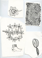
This is a hand-made book that I illustrated, designed, and built for my first assignment in my book media class.
2010-11-20
I may or may not be obsessed..."Mix and Match Your Own Vancouver Special"
"One man's waste is another man's treasure"
For my Digital Illustration class, I had to design and illustrate a poster with an "environmental" message. Looking around my room for inspiration, I noticed the clutter of objects. From magazine collections, to my rack of clothing, my laptop, cd's, jewelery, body products, books, and souvenirs, my room was full of consumed products. I also have several plastic tubs filled with things such as recycled decorative paper, light bulbs, ceramic tiles, stacks of magazines, piles of fabric scraps, and bags of mixed buttons and beads. So much stuff, that a friend once told me that my room looked like a dollar store. I was beginning to understand the full extent of that truth. This made me wonder why I continue to buy so many novelty items that I not need. Thinking back to two years ago when I watched Agnes Varda's film, "The Gleaners and I", I thought about how people could reuse their junk to create new valuable objects, and find new uses. Upcycling is not a new idea, and I found many websites that had great suggestions of reusing "waste".

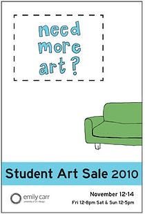
The three-day Student Art Sale at Emily Carr University ended on Sunday this week. For the past two years at ECUAD, I have regretted not submitting to this annual sale. This year, I finally got my stuff together organized, early enough to submit some of my art for the event.
This was a pretty educational experience for me. From learning to price my work, to learning the technicalities involved in high quality image scanning, colour correction, and the printing process. I spent several days at the Digital Output Centre preparing some of my illustrations into high quality prints on archival paper. The work was well worth is. The colours that the printer produces is amazing to me! Anyway, I sold two prints and have lots left over. To buy my prints, check out my store:
www.priscillayu.bigcartel.com
Here's a little thank you zine that I attached to all my items at the art sale.
Updated Version!
I have to admit it. When it comes to typography, I get overwhelmed. For some reason, more is always better when I choose type. The more serifs, embellishments, and curly q's the better. The more obscure and difficult to read, the more I like it. Unfortunately, in the area of communication, my taste for type can make things unclear. After chatting with my friendo, artist and designer, Max Olson, he helped me select type and decide type placement to better emphasize my illustration. My illustration stands louder than the text, and showcases the image. I should step outside my comfort zone and habits more often because I learned something new.
P.s. Max is in his third year at Emily Carr University of Art and Design with me! He majors in Communication Design and has amazing intuition for typography, colour, and form. I especially love his expressionistic mark-making pieces. Check out his stuff here: www.maxolson.ca
P.s. Max is in his third year at Emily Carr University of Art and Design with me! He majors in Communication Design and has amazing intuition for typography, colour, and form. I especially love his expressionistic mark-making pieces. Check out his stuff here: www.maxolson.ca
"Vancouver Special Matures to Star Status" article illustration design for my Illustrating Literature class.
I just had the critique in my Illustrating Literature class for an assignment that required creating one full-page for a short story or magazine article. Continuing my obsession with the Vancouver Special design houses, I decided to do my project on an article out of the Globe and Mail, about the Vancouver Special house being redesigned (http://www.theglobeandmail.com/real-estate/the-vancouver-special-matures-into-star-status/article1710440/). I'm really excited by this project because although it's not perfect, it displays what I have learned in my Digital Illustration class in the past two months. The digital world no longer frightens me, keeping me at a distance, and intimidating me. In fact, I think that I'm going to utilize what I've learned more in my other classes, and I'm even thinking about getting a tablette for digital drawing. For this assignment, I used a combination of Adobe Illustrator, Adobe Photoshop, as well as traditional tracing paper, and ink drawing. Here is what I came out with, along with some images of my process.

These Vancouver Special homes are commonly disliked by many people within Vancouver, and the surrounding suburbs for their boxy, undesirable aesthetic. They were built and spread around the lower mainland like weeds, for their practicality in using the lot space, and for their familiarity for the city contractors.
Building off that metaphor of Vancouver Special houses as weeds, wide-spreading, and a nuisance, commonly thought of as pests to most, yet beautiful to others, I began to think about the houses as little dandelions. I thought that it was fitting with the article, and would make a good full-page illustration to draw the viewer into the story. The red background and title type are meant to emphasize the "star status" of the Vancouver Special houses, as it references an old Hollywood theme.
Subscribe to:
Posts (Atom)


